Academic Project - 2023
Focus: UX/UI Prototyping
Duration: 1 month
Project Overview:
Nux is a new (fictional) online streaming service specializing in multimedia thematic content. Their mission is to connect consumers with a range of thematic content, bridging movies, web series, online courses, documentaries, video games, and more. For instance, if you enjoyed watching Gladiator, the platform will suggest related content, such as docuseries or TED talks on the Roman Empire. This thematic content would then we organized to provide each user a personalized landing page.
As a result, the following pages will detail each step of my process in developing this user interface to ensure a seamless experience for the NUX platform.
Heuristic Evaluation
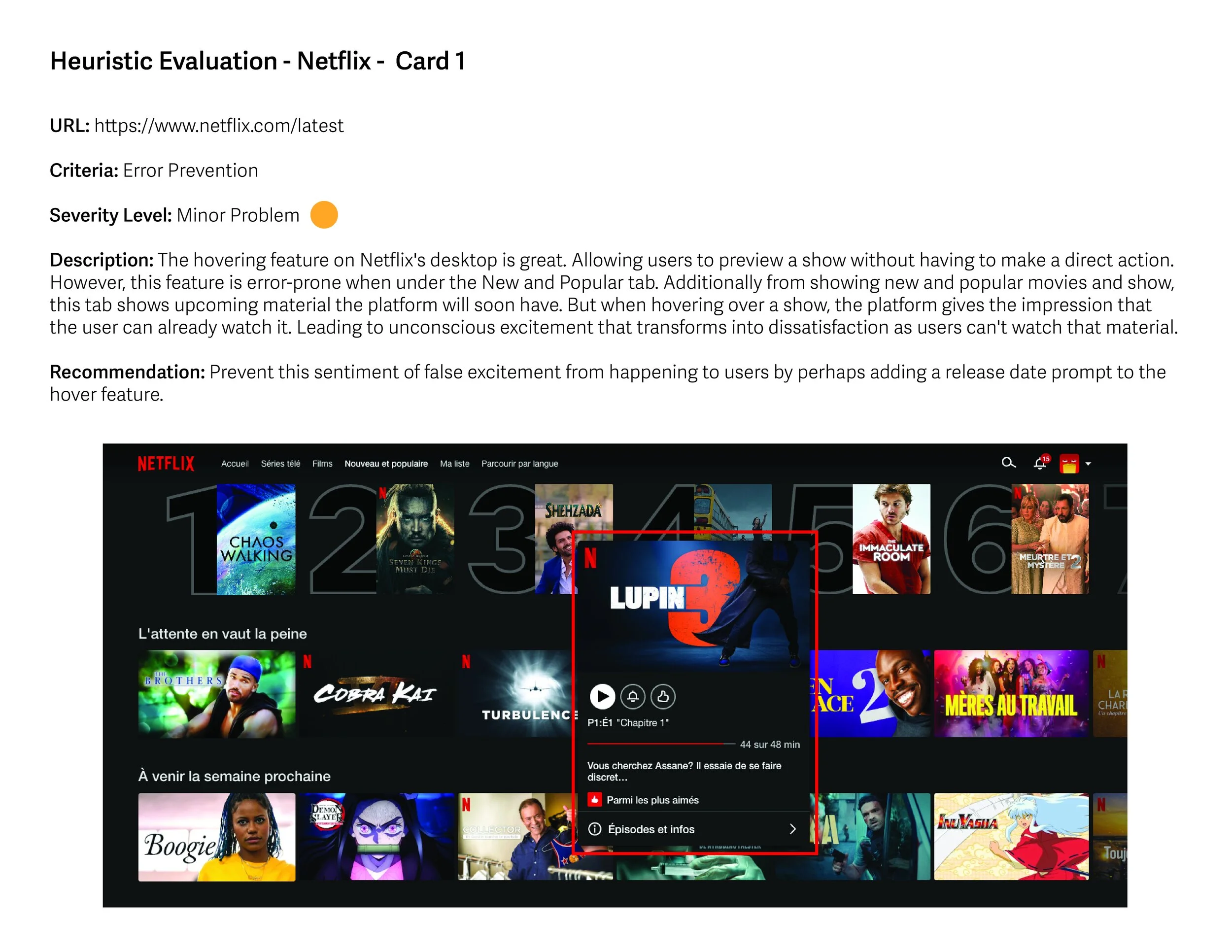
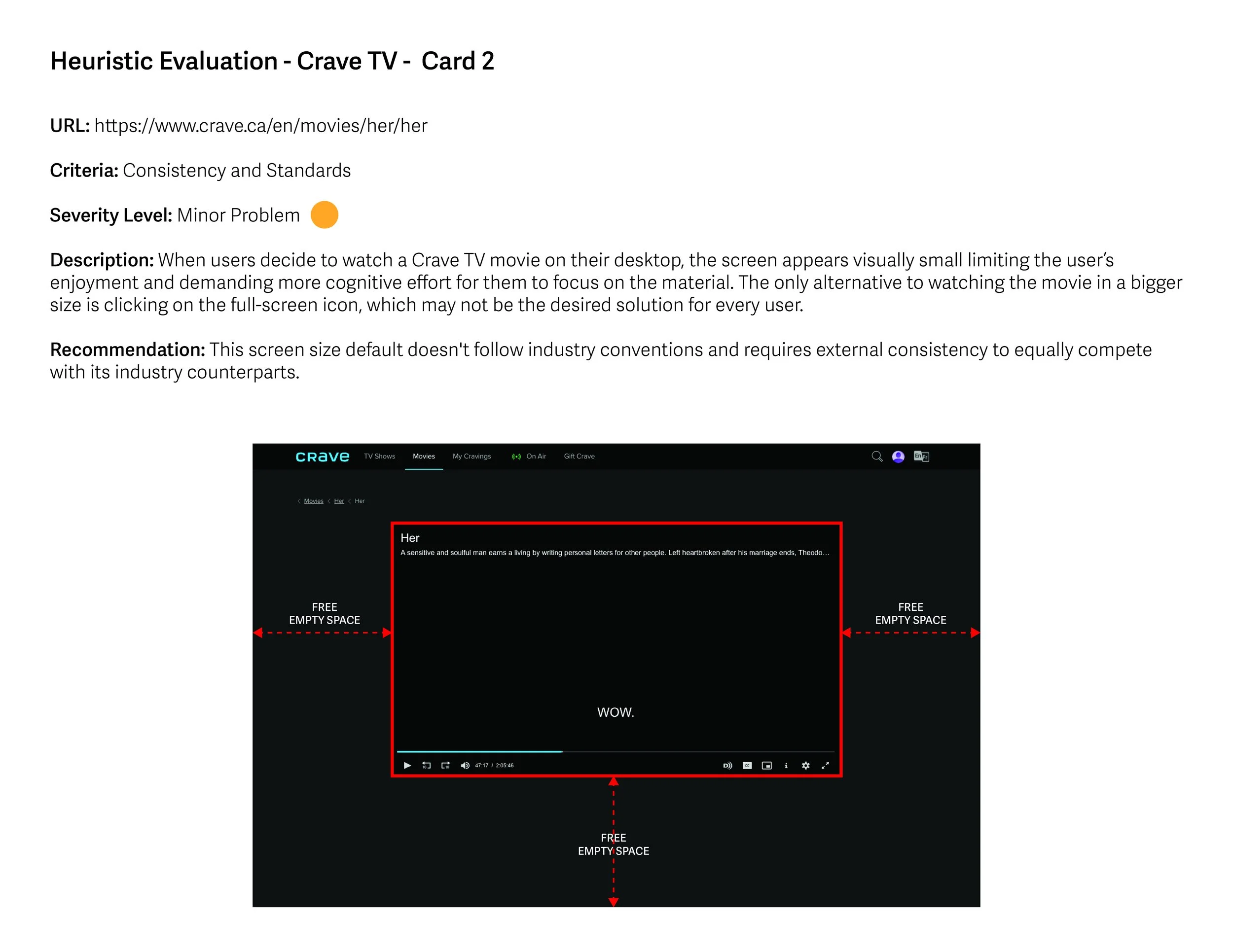
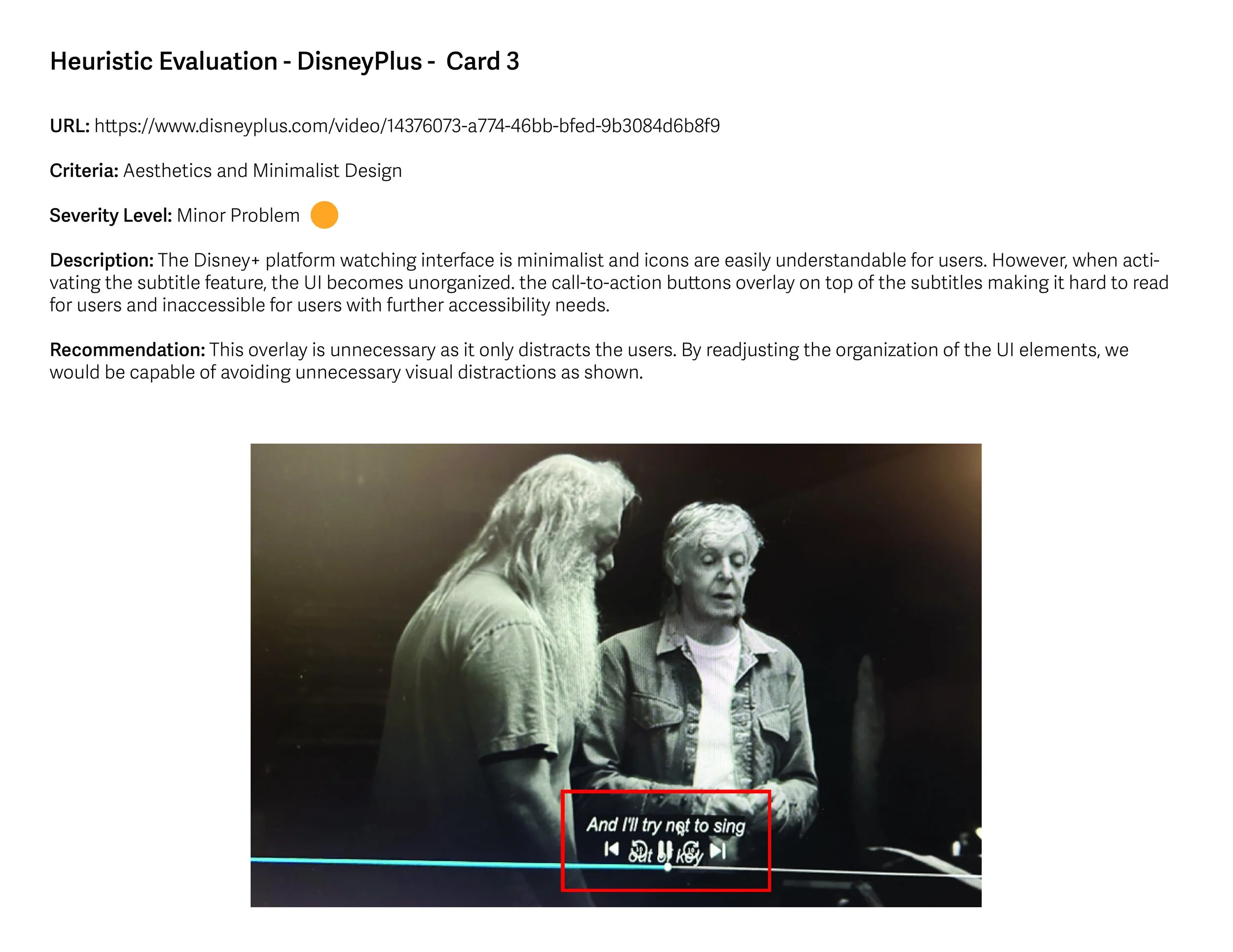
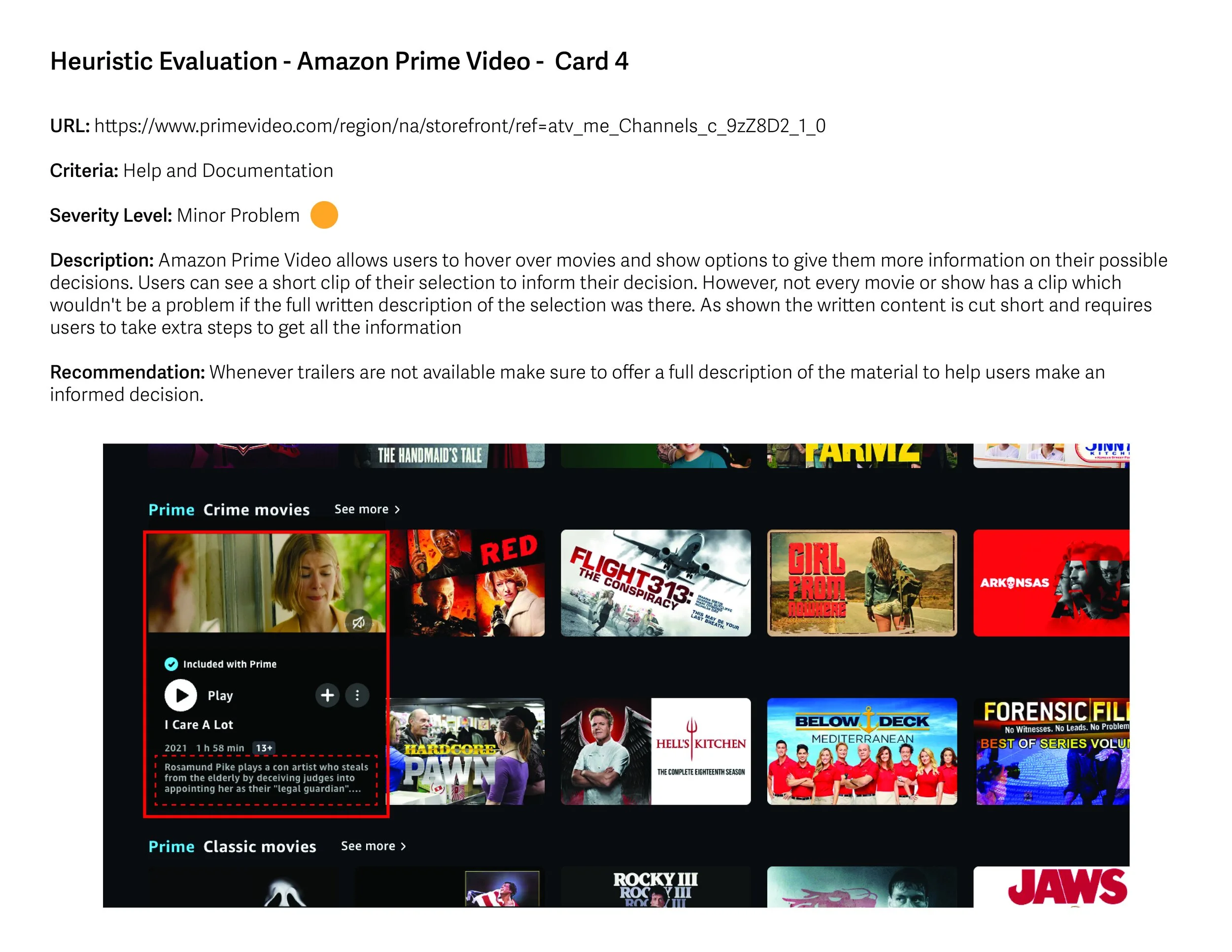
In the initial phase, I conducted a heuristic evaluation of several streaming competitors' benchmarked platforms, aiming to identify various usability issues using Nielsen's ergonomic criteria. In the following five slides, you'll discover five distinct observations categorized by their severity levels.
Persona
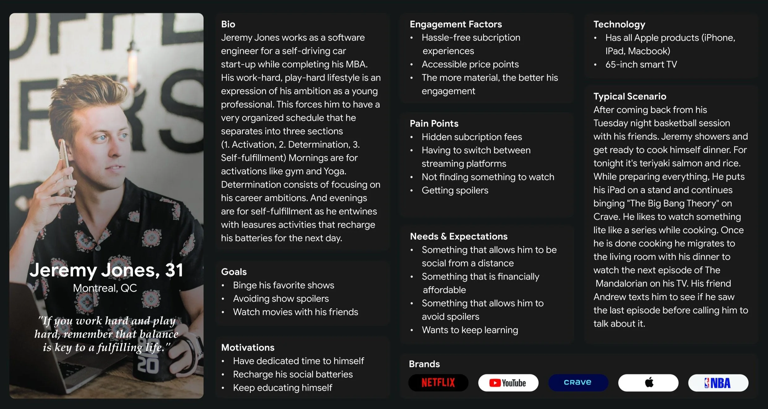
After conducting four semi-structured interviews, each comprised of 12 questions that focused on users' streaming intentions, habits, and desires, I created the persona of Jeremy Jones. The purpose behind this authentic archetype is to serve as a guiding influence in the project's development.
Jeremy Jones works as a software engineer for a self-driving car start-up while completing his MBA. His work-hard, play-hard lifestyle is an expression of his ambition as a young professional. This forces him to have a very organized schedule that he separates into three sections (1. Activation, 2. Determination, 3. Self-fulfillment) Mornings are for activations like gym and Yoga. Determination consists of focusing on his career ambitions. And evenings are for self-fulfillment as he entwines with leisure activities that recharge his batteries for the next day.
Content and Card Sorting
NUX aims to provide its users with an innovative method for showcasing their favorite content. To accomplish this goal, we carefully curated a selection of content tailored to align with Jeremy's streaming preferences.
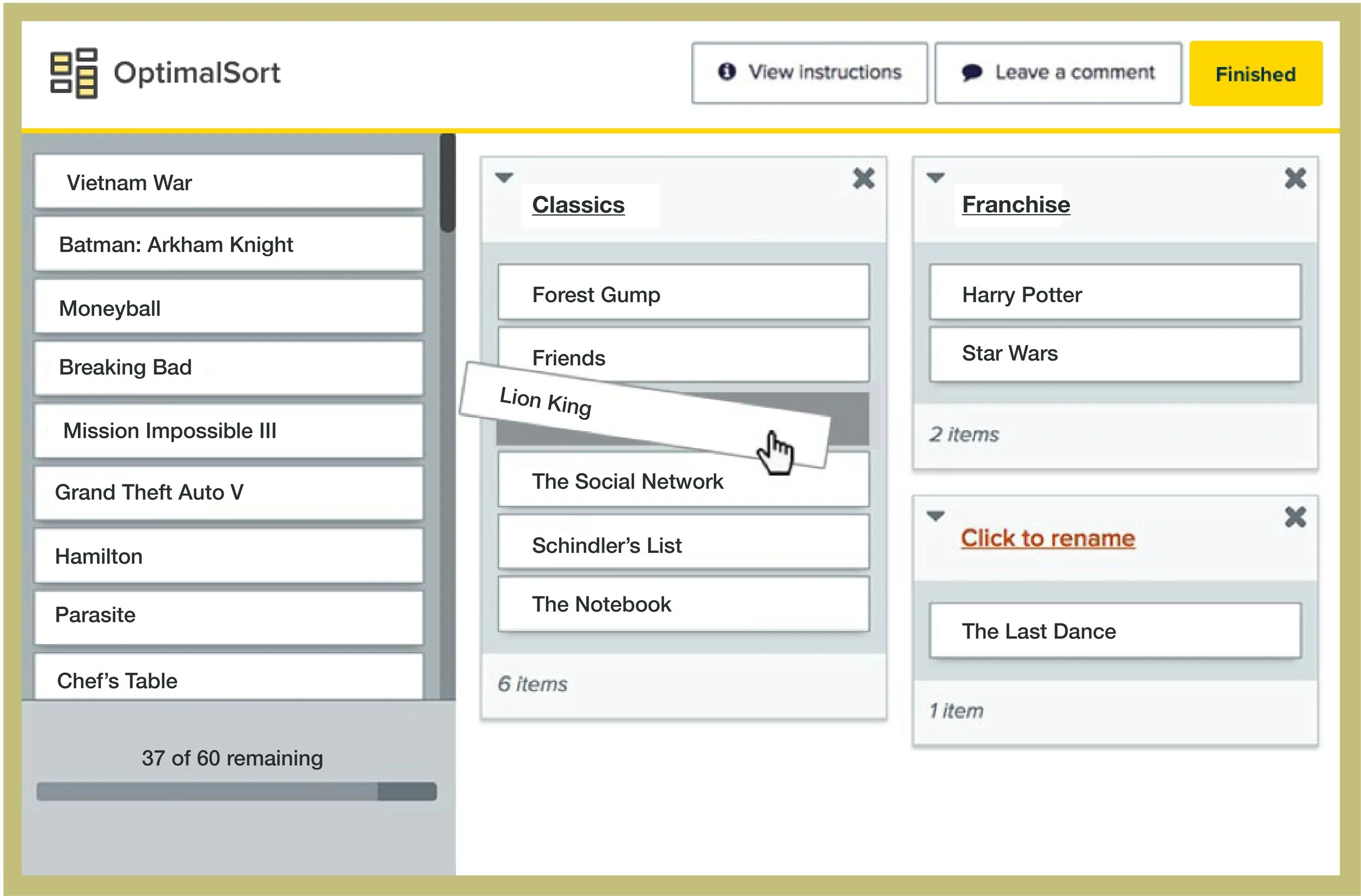
Through an open card sorting exercise conducted on Optimal Workshop, we engaged 16 participants to organize this content in a manner that resonated most with them. Essentially, we asked them to sketch a mental model of what they envisioned their landing page to resemble. From this card sorting exercise, we uncovered three key insights that informed our approach to creating the information architecture.
Ambiguous or Irrelevant Categories: When analyzing the results, I was surprised by how users labeled and grouped certain cards differently. This observation left me puzzled and raised questions about the relevance of the established categories. Eventually, I realized that users might have also been uncertain, resulting in unclear categories.
Terminology is different for every user: Open card sorting ready depicts users' mental models and showed how unique every mind can be. Although the grouping of some elements made sense to different groups of users the terminology was different in almost every case. I suppose it makes sense since we don't all have the same vocabulary.
Confidence in Frequency: Frequency serves as an indicator of common user patterns when grouping cards. These recurring patterns have been instrumental in informing and guiding me while organizing the information architecture.
Information Architecture and Site maps
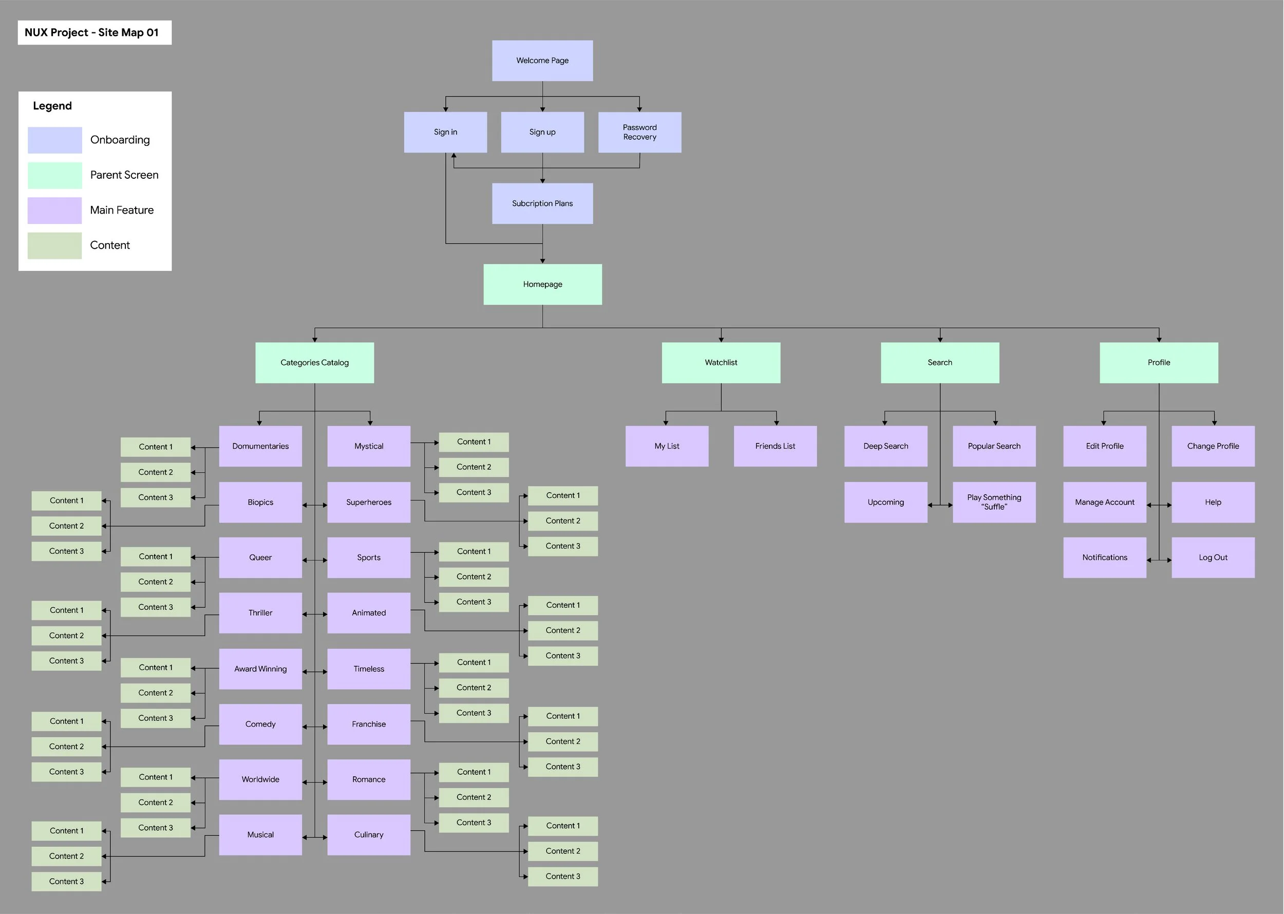
Here is the first site map created based on the data obtained from the open card sorting.
During my tree testing and reviewing process, which took a total of 8 days and 2 iterations, I gained valuable insights into information architecture and organizing a site map. While my first site map allowed users to access the content they needed, I realized that the abundance of categories was affecting its usability. For example, categories like suspense, thriller, and crime were understood by users, but they seemed too similar and slowed down the navigation process. Additionally, I learned that users associate their movie watchlist with their user profile. This confusion affected the social element of the platform which was needed for my persona.
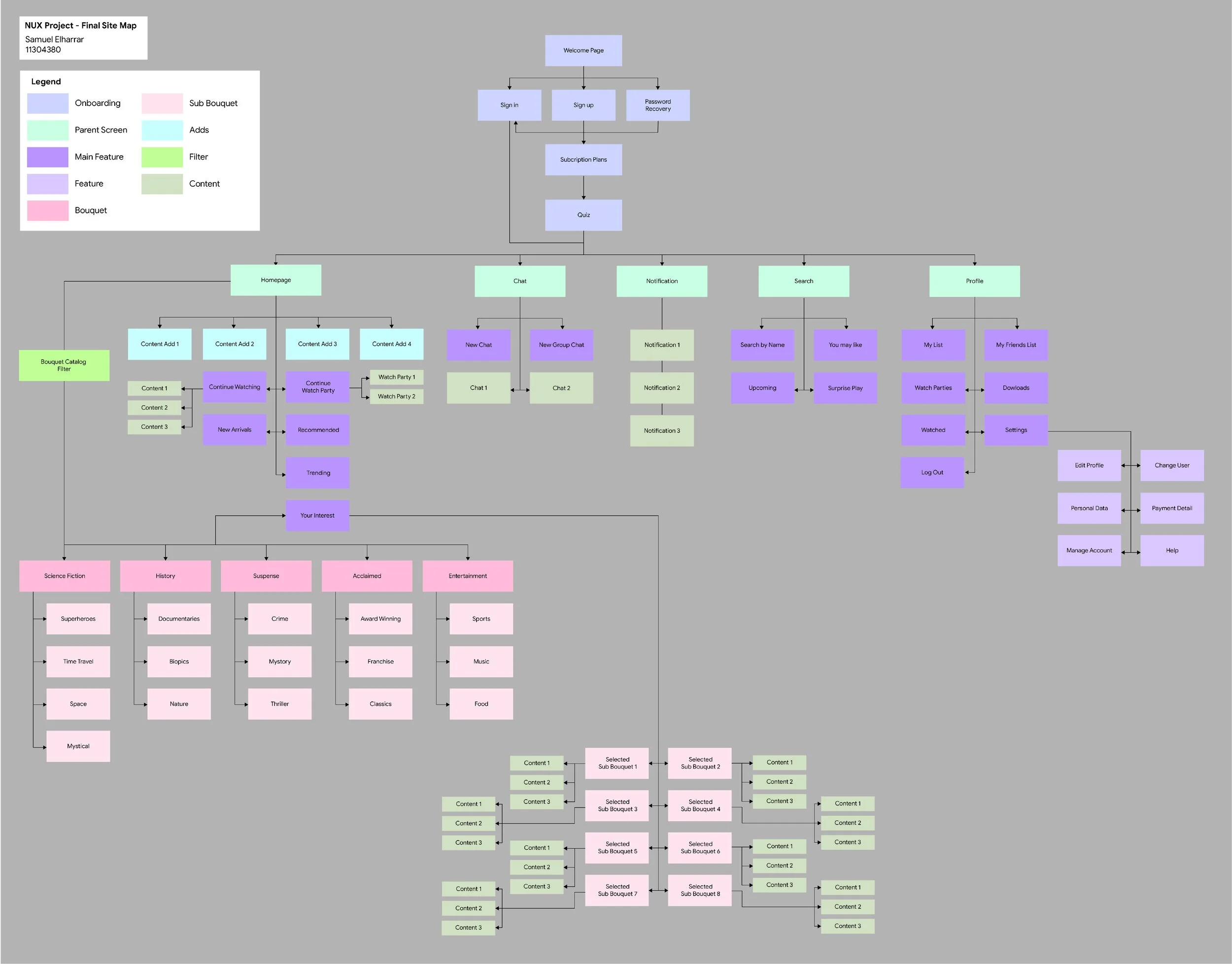
Based on these insights, I made two key changes to the site map. First, I reorganized similar content categories into new "bouquets" and introduced sub-bouquets for refined search results. All filtered bouquet content now appears in the "Your Interests" section on the user homepage.
Second, I integrated the watchlist with the user profile to enhance the social experience, allowing users to easily track and share their favourite movies and shows with their network, making the platform more interactive. This resulted in the final site map.
Low & Medium Fidelity Prototyping
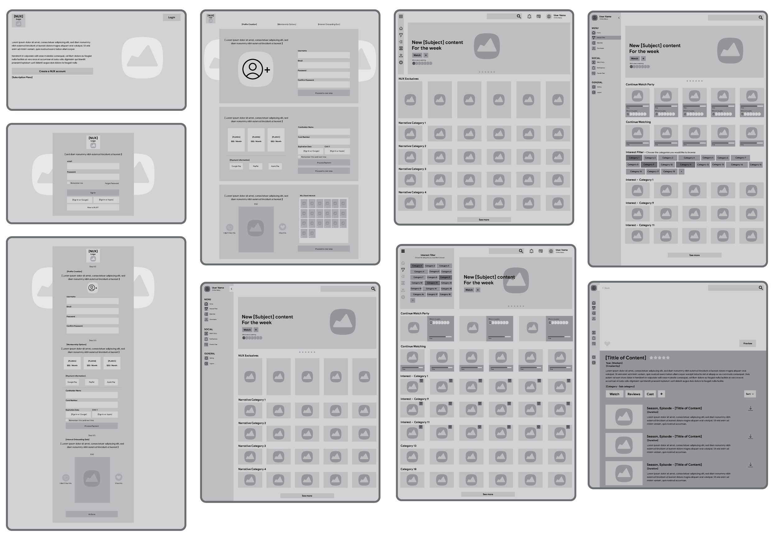
Creating prototypes and wireframes are instrumental in shaping your digital platform. Here a pshow Medium fidelity prototypes as they strike a balance between detail and flexibility, allowing you to visualize key features effectively. These prototypes serve as the foundation for the NUX platform layout and structure, ensuring that it aligns with user needs and project goals.
Visual Design and High-Fidelity Prototyping
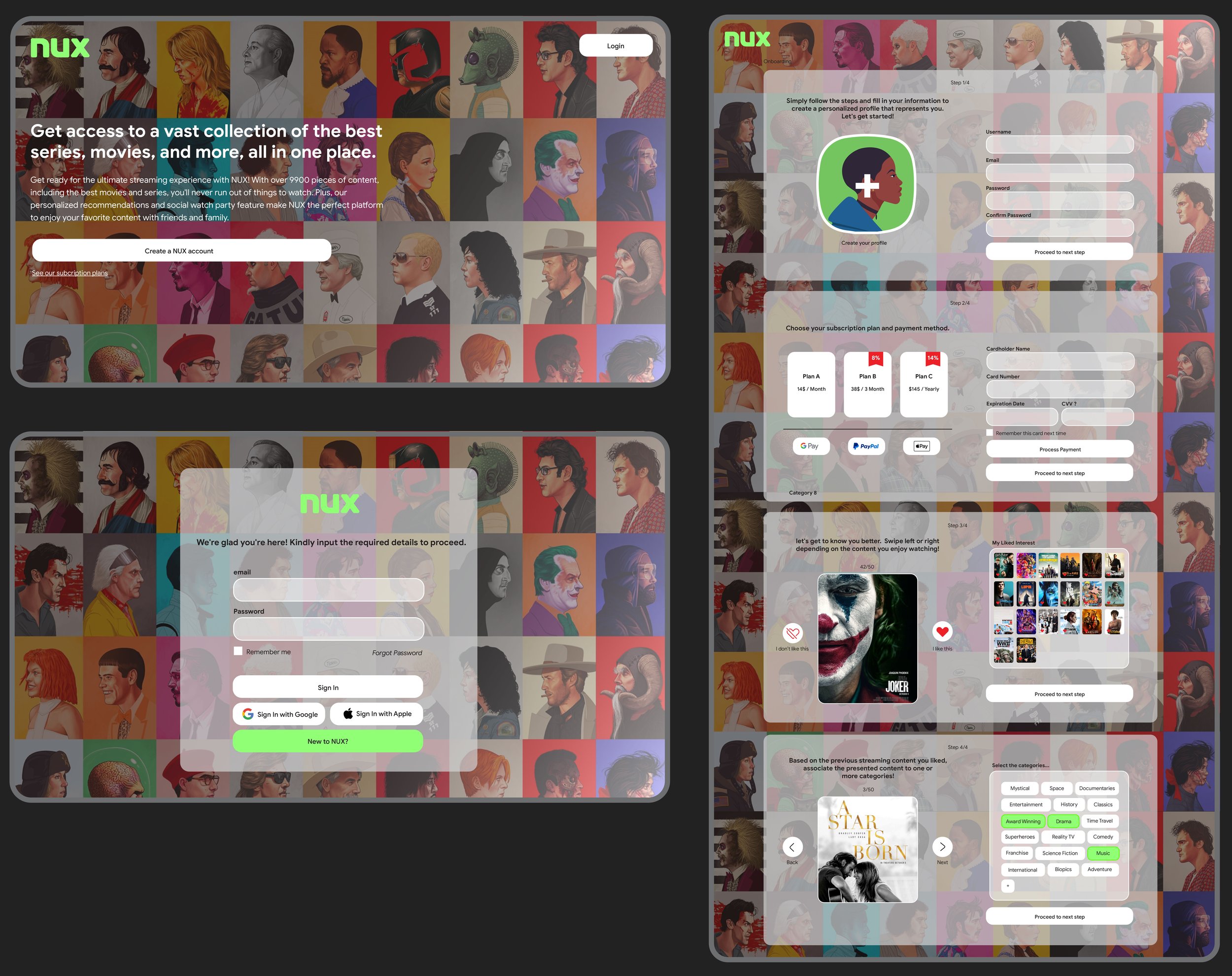
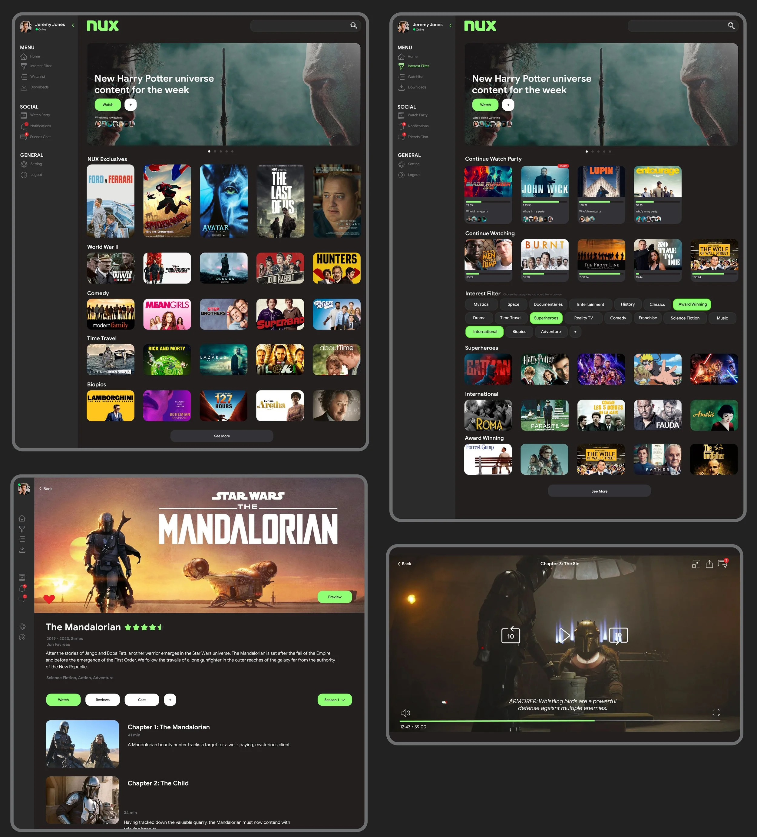
After testing the frames via a basic Adobe XD prototype, I have successfully finalized the wireframes that shape the NUX platform. My attention is now directed towards UI design and Hi-Fi prototyping, where I'm applying Gestalt design principles, establishing a strong visual hierarchy, and leveraging other graphic design principles. This approach aims to create an elegant, engaging, and user-centered interface, ensuring a seamless and delightful user experience.
